
Project Highlight - Mid-Century Modern Master Bath Renovation
If I had to identify the two aspects of interior design that I enjoy the most, they would have to be space planning and integrating my client’s style into their home. In fact, nothing makes me happier when a client says to me, “You got us!”
Space planning involves optimizing the available space by creating the most functionally attractive layout possible. This is where thinking “out-of-the-box” often requires the client to take a step back and let go of their pre-conceptions about design and design elements.


Such was the case in a master bath renovation that I recently did for an existing client. (I had previously completed a kitchen renovation for this couple 4 years ago.) This particular client loves to work within the design idiosyncrasies of their circa 1950 ranch house and pull in some mid-century modern elements whenever possible. Their house has a ton of quirky architectural elements, not all of which make sense when trying to maximize the available space. Besides the fact that the existing master bath had never been renovated in 70+ years, there were several “blind spots” and “dead zones” in the floor plan – spaces where we weren’t exactly sure what was hidden in the walls.
Older homes often have built-ins that might have been considered cool design elements in the 50’s, such as deeply recessed medicine cabinets behind the extra deep vanity cabinet. But often times, this extra depth simply leads to things getting lost in the back of cabinets – never to be found again. I always do a floor plan for my clients and the GC to not only show my new concepts, but also a version that shows the existing footprint and the mysterious areas in question.
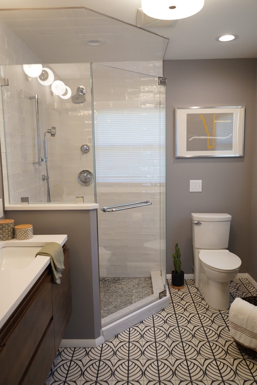
We knew that we had to gut the entire space, which had two smaller closets and a very small shower/toilet area. But the client had only envisioned sticking with the existing layout until I showed her the possibilities if we stole just a little extra space from the master bedroom area. By expanding the bathroom 18” into the bedroom I was able to get them a large walk-in closet and an open and light-filled bathroom.
The one hang-up for the client to my new design concept was the fact that she did not like corner showers. I went through several iterations of the floorplan to show her that the corner shower was indeed the best option for the space, but she was still unsure. What finally convinced her was a business trip where she stayed at a modern hotel that had a corner shower in the bathroom.
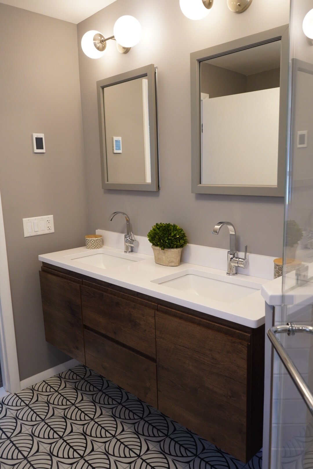
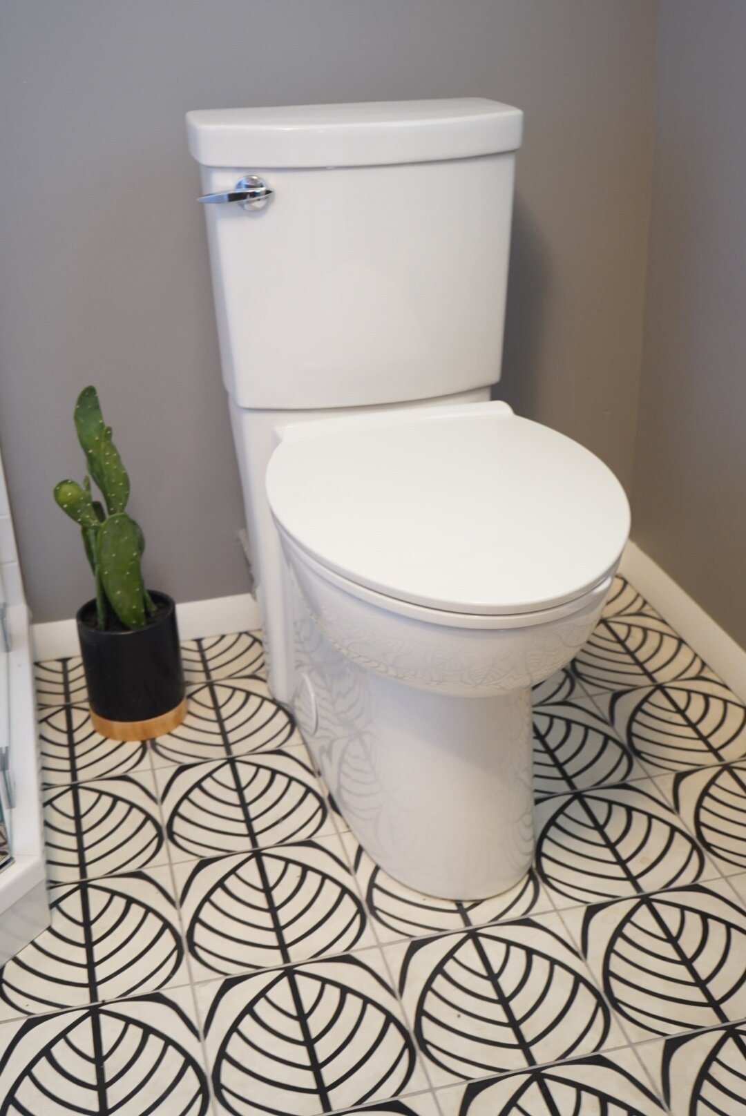
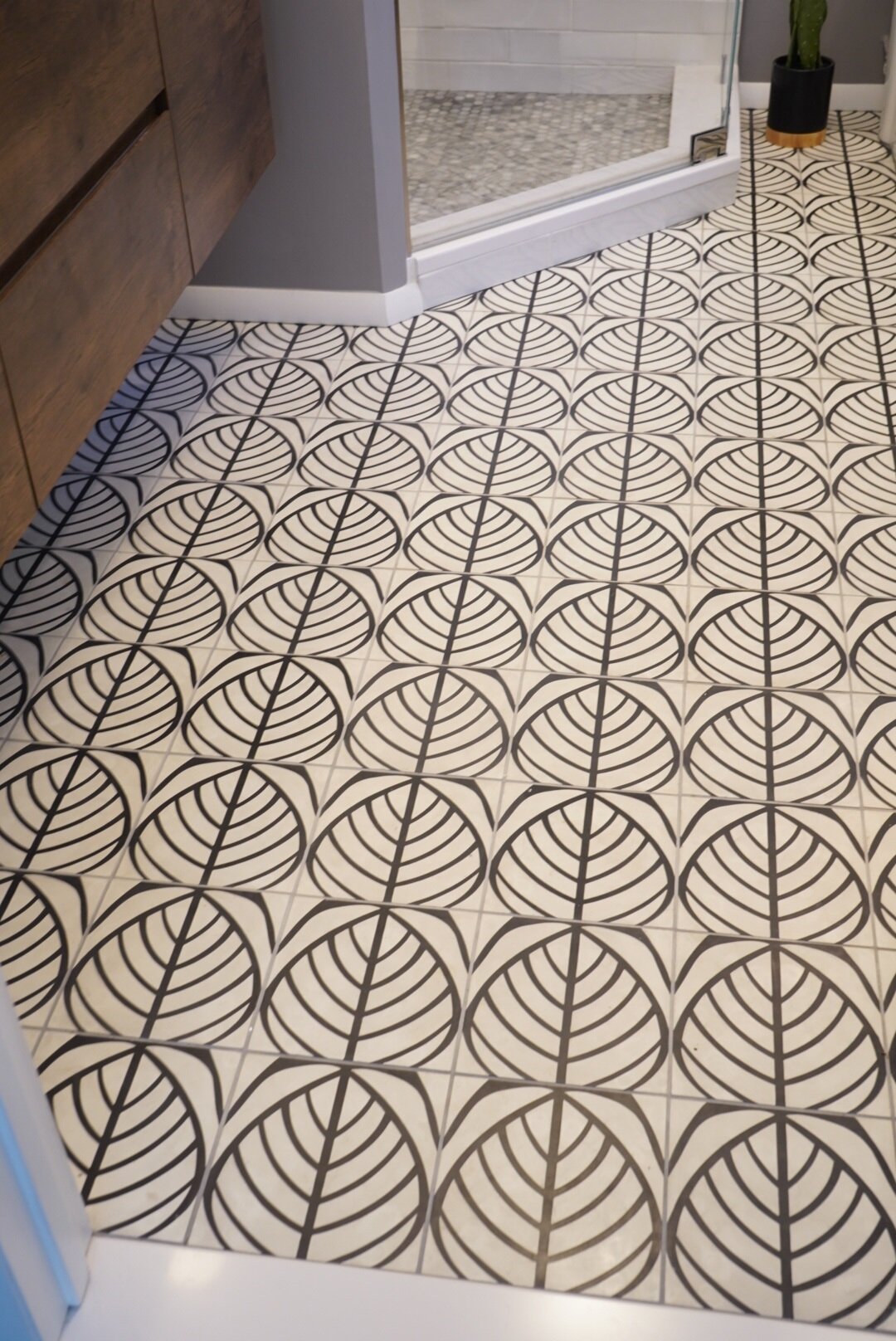
The client has a really cool design style and was open to pulling in a retro leaf design in a cement floor tile. (Which I found on sale at my local tile resource.) We purchased a floating wood vanity (they love natural dark woods) which we retrofit with a quality quartz top and undermount sinks. (See my blog on tips for purchasing vanities on-line). The rest of the design incorporated clean-lined elements such as the globe vanity lighting and a concealed trap toilet.
It is often the case where clients have preconceived notions and prejudices about certain design elements that stop them from embracing a new layout or design. Fortunately this client trusted me in the end and the results speak for themselves.